The Truth About Hubble, JWST, and False Color
- By Maggie Masetti
- September 13, 2016
- Comments Off on The Truth About Hubble, JWST, and False Color
I get a lot of questions asking why the James Webb Space Telescope is infrared, and how its images can hope to compare to the (primarily) optical Hubble Space Telescope. Why would NASA build something that isn’t going to capture beautiful images exactly like Hubble does? The short answer to this is that JWST will absolutely capture beautiful images of the universe, even if it won’t see exactly what Hubble does. (Spoiler: it will see a lot of things even better.)
There are legit scientific reasons for JWST to be an infrared telescope. We actually have blogged about them here on Blueshift, and have since adapted what we wrote into the current science pages on the JWST site. To summarize, there are things Hubble can’t see that we want to know more about, and we need an infrared telescope to learn about them. Things like: stars and planets being born in clouds of dust and gas; the very first stars and galaxies which are so far away the light they emit has been pushed into the infrared, and the chemical fingerprints of elements and molecules in the atmospheres of exoplanets.
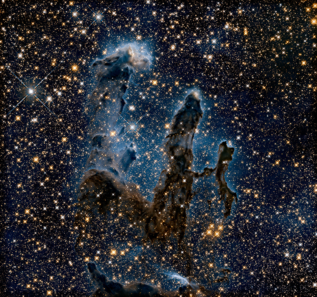
The NASA/ESA Hubble Space Telescope has revisited one of its most iconic and popular images: the Eagle Nebula’s Pillars of Creation. This image shows the pillars as seen in infrared light, allowing it to pierce through obscuring dust and gas and unveil a more unfamiliar — but just as amazing — view of the pillars. In this ethereal view the entire frame is peppered with bright stars and baby stars are revealed being formed within the pillars themselves. The ghostly outlines of the pillars seem much more delicate, and are silhouetted against an eerie blue haze. More information. Credit:
NASA, ESA/Hubble and the Hubble Heritage Team
JWST actually will see a bit of optical light: red and orange. But the truth is that even though JWST sees mostly infrared light doesn’t mean it won’t take beautiful images. The beauty and quality of an astronomical image depends on two things: the sharpness of the image and the number of pixels in the camera. On both of these counts, JWST is very similar to, and in many ways better than, Hubble. JWST will take much sharper images than Hubble at infrared wavelengths, and it has comparable resolution at the visible wavelengths that JWST can see. JWST has incredibly sensitive, state-of-the-art detectors in its cameras. (This page has detailed info if you want to read more about them.)
The infrared data that will come from JWST can be translated by computer into something our eyes can appreciate – in fact, this is what we already do with Hubble data. The gorgeous images we see from Hubble don’t pop out of the telescope looking like they do when you view them on the web. Hubble images are all false color – meaning they start out as black and white, and are then colored. Most often this is to highlight interesting features of the object in the image, as well as to make the data more meaningful. Sometimes colors are chosen to make them look as our eyes would see them, called “natural color,” but not always.
This is my favorite feature (from Hubblesite.org) about how Hubble images are colored, and I highly recommend reading through it. Use its left menu to click through the short presentation. Here is a sub-page specific to creating an image using infrared light.
Hubblesite also has this feature on how “natural color” imagery is created.
See also this more technical page on Hubble image processing.
Here’s another compelling argument for telescopes that see things other than visible light – not everything in the universe emits visible light. There are many phenomena which can only be seen, for example, in the X-ray part of the spectrum, or in the ultraviolet. When we combine images taken at different wavelengths of light, we can get a better understanding of an object, because each wavelength can show us a different feature or facet of it. Just like infrared data can be made into something meaningful to human eyes, so can each of the other wavelength of light, even X-rays and gamma-rays.
Here is an image of the M82 galaxy using X-ray data from Chandra, infrared from Spitzer, and visible light from Hubble. Also note how aesthetically pleasing the image is despite it not being just optical light:
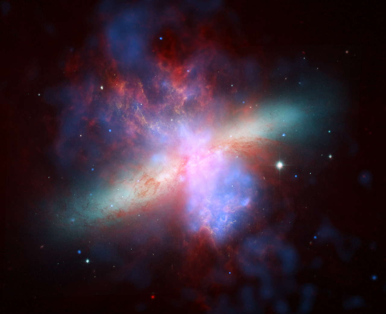
Composite of multi-wavelength images of the active galaxy M82 from the three Great Observatories: Hubble Space Telescope, Chandra X-Ray Observatory, and Spitzer Space Telescope. X-ray data recorded by Chandra (courtesy of NASA/CXC/JHU/D.Strickland) appears here in blue; infrared light recorded by Spitzer (courtesy of NASA/JPL-Caltech/C. Engelbracht (University of Arizona)) appears in red; Hubble’s observations (courtesy of NASA, ESA, and The Hubble Heritage Team (STScI/AURA)) of hydrogen emission appears in orange, and the bluest visible light appears in yellow-green. More information.
If you search, you can find many examples of beautiful multiwavelength or infrared imagery – this relatively recent one is a favorite. Though Hubble sees primarily visible light, it can see some infrared. And despite not being optimized for it, and being much less powerful than JWST, it still produced this stunning image of the Horsehead Nebula.
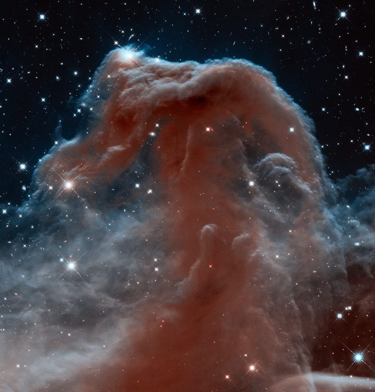
The Horsehead Nebula in Infrared from Hubble
Image Credit: NASA, ESA, and The Hubble Heritage Team (STSci/AURA)
It’s a big universe out there – more than our eyes can see, or even our brains can process. But with all the telescopes now at our disposal (as well as the new ones that will be coming online in the future), we are slowly building an more accurate picture. And it’s definitely a beautiful one.
Other resources:
– Imagine the Universe’s example of the Crab Nebula and what each wavelength can tell us about it.
– Chandra’s archive (by year) of multiwavelength images you can explore
– Blueshift’s podcast, Making Data Beautiful – we interviewed 2006 Nobel Laureate John Mather about the importance of imagery in communicating science and sharing data with the public. More than just “pretty pictures,” data can be used to tell a story and explain the mysteries of the cosmos. Not every piece of data would be considered a work of art, but the information contained is at the very heart of NASA science.
– Blueshift’s podcast, The Making of Pretty Pictures – We interviewed Dr. Randall Smith of the Harvard-Smithsonian Center for Astrophysics, a collaborator on the Aesthetics & Astronomy project that is looking into how the public perceives multi-wavelength astronomical imagery. A team of scientists, educators, and psychologists are examining the intersection of science and art in the processing of astronomical data.