Try It At Home: X-ray Data: Light curves, Spectra & Images Activity
- By Maggie Masetti
- September 23, 2011
- Comments Off on Try It At Home: X-ray Data: Light curves, Spectra & Images Activity
Here at the Astrophysics Science Division, we have a large group that studies X-ray astronomy. X-ray astronomy doesn’t get as much press as observations from telescopes like the Hubble, but nevertheless is a very valuable tool for understanding how the universe works.
In this blog entry we’ll talk about how X-ray observations differ from those made at optical wavelengths, what kind of data you get from X-ray telescopes, and we’ll give you a fun activity you can try at home or in the classroom to demonstrate the different types of X-ray astronomy data (which will include light curves, spectra, and images).

The Chandra spacecraft
Why are X-ray observations different from optical ones? Well, differences arise because X-ray and optical photons have different energies. We know that light can act as a wave or as a particle, depending on how we detect and measure it. In general, in astronomy we utilize the wave properties of light at lower energies, and the particle properties at higher energies. Single optical photons are more difficult to observe because most optical sources typically emit too many of them to count individually. In contrast, X-ray sources generally emit fewer high-energy photons so that X-ray detectors can detect and measure individual X-ray photons, and over time, accumulate enough photons to make an accurate picture of the total source.
A good comparison would be to imagine looking at a light bulb and seeing the white light coming from it a photon at a time. First you’d see one red photon, then one blue one, then one yellow one, then perhaps another red, then a green, and so on. After you had seen enough photons, you could combine them and say “Ah, I see, it’s white light.”
Photons can be used in three ways to give us information about the sources that are emitting them. We can count the number of photons coming from a certain area of the sky and make an image of it, we can measure the energies of the photons being emitted from the source that we are looking at, which gives us a spectrum, or we can make a graph, called a light curve, that will show us how bright a source is over time. Scientists use all of these tools to help understand objects in our Universe.
Images
You are probably most familiar with the concept of an “image”. When you take a picture with your camera, you are capturing the distribution of light coming into the shutter. Similarly, telescope optics work by either reflecting light with mirrors or refracting it with lenses into an eyepiece or a camera. Either way, the image created from incident light from space gets magnified, allowing us to capture spatial images of the sky. In much the same way, an X-ray telescope can concentrate the light from an X-ray star onto a small portion of an electronic eye. This detector can then record both how many photons are hitting it, which tells us about the brightness of a source, and the location where the X-ray photon strikes it, which tells us its position. Such an “imaging detector” can view several X-ray emitting objects simultaneously, like a cluster of stars, or can create pictures of regions from which diffuse X-ray emission arises, like a cluster of galaxies.
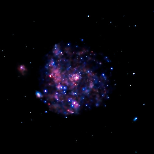
X-ray image of the M101 Galaxy taken by the Chandra satellite. Credit: NASA/CXC/JHU/K.Kuntz et al.
Light Curves
A light curve is a graph of intensity over time. Such a graph is made by counting the number of photons coming from a source over a period of time. For example, by counting the number of X-rays being emitted by a star every second for an hour, you could generate a light curve from your observations. Your light curve would tell you how bright your source is and the amount of time it remained at that brightness. A graph similar to a light curve can be generated for any physical measurement which is repeated over and over in time. You could count how many people passed in front of you during a ten minute time interval while you sat on a park bench during your lunch hour. You could generate a “light curve” for this as well, but it would have no astronomical value (of course!).
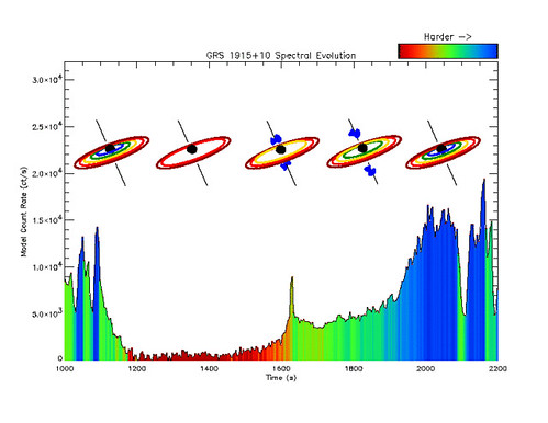
Light curve of black hole GRS 1915+105 with a disk of matter around it. Data is from RXTE. Credit: Craig Markwardt
Spectra
Spectroscopy is simply the science of measuring and graphing the intensity of light at different energies. X-ray light contains a range of energies just like visible light, with its range from reds to blues. Spectrometers count the number of photons of differing energies hitting it. A graph of the number of photons over an energy range can tell us how the source is producing its X-rays, and give us clues as to what kind of object it is. Spectra of stars can give us information about their composition, since particular elements emit light at characteristic energies evident as peaks in the spectrum. Spectra of black holes can reveal orbiting disks of matter.
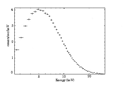
Example spectra using RXTE data, of a pulsar, a very swiftly rotating neutron star that gives off pulses of X-rays. Credit: NASA
Activity
This activity can be used to explain all three methods of X-ray detection: imaging, spectroscopy, and light curves. You will need two bags of m&m’s or Skittles, two boxes with a hole poked in each just large enough for individual candies to fit through, and either a meter square piece of paper with grid lines drawn on it, or a number of large egg cartons. You will need stopwatches, or watches with a second hand, for Part C.
Part A: Imaging
Put approximately 20 candies in one box, and approximately 10 in the other. This can be varied. If you are doing this with kids or students or just someone else, do not let them know how many candies are in each box. Plug the hole in the box so the candies don’t fall out. Hold the boxes approximately 1 ft. apart and 1 ft. above the grid or the egg cartons. These two boxes are now your X-ray sources, the candies are photons, and the grid or egg carton is your X-ray detector. Unplug the hole gently shake the boxes so the candies fall down onto the grid or into the egg carton. Draw the distribution of candies on paper. What does this distribution tell you about the number of candies in each box? If the candies are photons and the boxes are X-ray sources, what does the distribution tell you about the brightness of each source? If you didn’t know how many boxes of candies there originally were, would they be able to tell from the distribution of candies on the grid? If you hold the boxes close together and then shake the candies out, does it make it harder or easier to distinguish the number of X-ray sources you had? This can be a good lesson on resolution; sometimes X-ray sources that are really close together can appear to be one big source.
Part B: Spectroscopy
Repeat the exercise but this time have whoever is doing the activity count the number of candies by color, i.e. the number of red, green, brown, and blue m&m’s. Have them tally the candies over the whole grid, not just for each source. Have each color of candy represent a different energy. Depending on the age of your students, you can use real X-ray energies, i.e., have brown = 2-10 keV, red = 10-30 keV, blue = 30-100 keV, and green = 100-250 keV, or just make up energies. Now graph how many candies are at each energy. This is the spectrum for your sources. Next, pretend that your detector can see both how many photons are at each energy, and where they fall spatially. This means you can resolve both sources and you can make a spectrum for each one! Which source is more energetic?
Part C: Light Curves
Fill one of the boxes with candies. Plug the bottom. When you unplug it, time the candies draining out for six ten-second intervals. Count how many candies fall out in each ten-second interval. (You can do this for longer than one minute). Graph how many “photons” there were over each interval; this is a light curve of intensity (how many candies) over time (60 seconds).
Additional Graphing Activity
When making a graph, one variable goes on the X-axis and the other goes on the Y-axis. Is it important which variable goes on which axis?
The answer is, YES!
It is standard that the variable that is “independent” goes on the x-axis and the variable that is “dependent” goes on the y-axis. How do you know which variable is independent and which is dependent? The names “dependent” and “independent” give the necessary clue. Namely, the “independent” variable is the one that can be changed or that varies by itself. The value of the “dependent” variable depends on the value of the independent variable.
For example, if you were graphing rainfall in California vs. time of year, then time of year (in months, for example) would be the independent variable. The amount of rainfall, which depends on the time of year, would be the dependent variable. (There is less rain because it is July; it is not July because there is less rain!)
Graph the following, making up your own data. Label the axes.
1. Tree height vs. time (over several years)
2. The speed a car is going vs. the distance it takes to stop completely
3. Cost of house vs. number of rooms in the house